Portfolio Concept
AERFORM.
A product experience with a pulse.
- Project type
- Interactive footwear / Ecommerce concept
- My role
- Creative direction, product UX & development
- Explore the experience
- View live site
01 / Overview
A sneaker made to be explored.
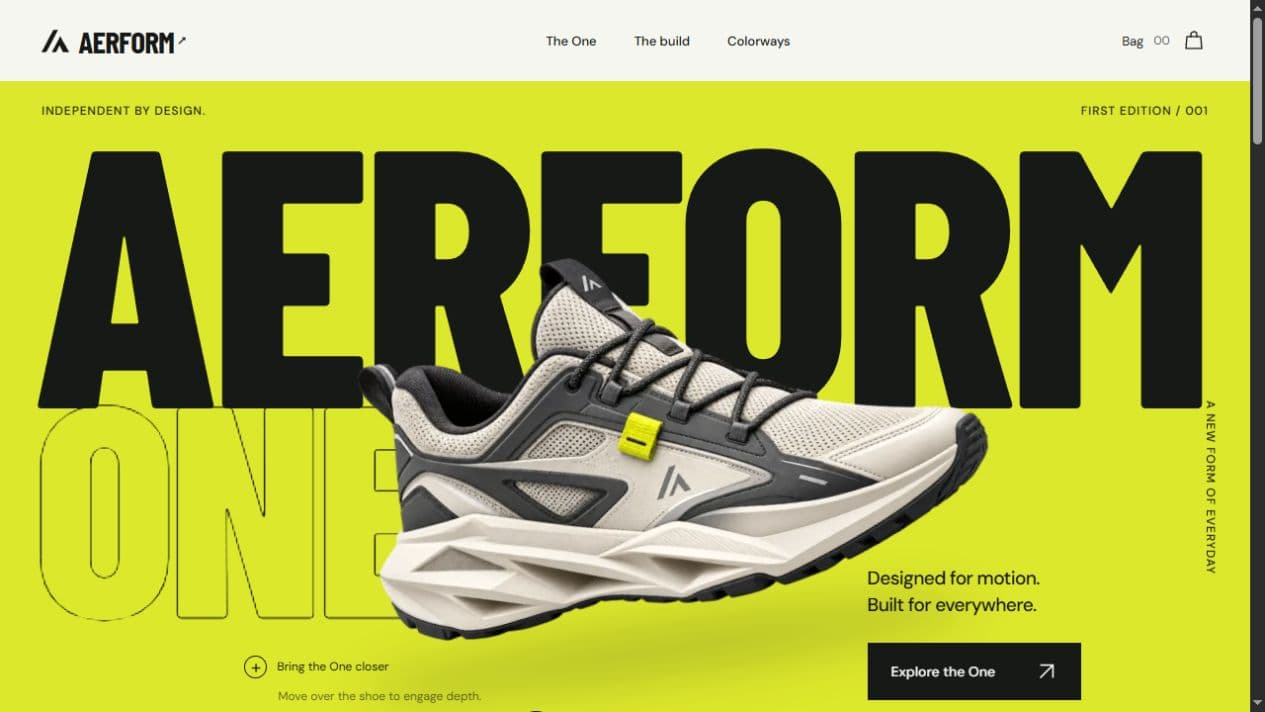
AERFORM is a fictional footwear brand built as an interactive ecommerce concept. The project explores how motion, product presentation, and a clear shopping flow can work together to give a single product a distinctive digital presence.
Self-initiated portfolio concept, not a paid client. The sneaker, brand, price, and store are demonstrations. No real orders or payments are taken.
02 / Design challenge
Make it expressive. Keep it usable.
The challenge was to give the product energy without burying the details people expect from a product page. The experience needed a strong first impression, room to explore construction and color, and a straightforward way to select a size and try the demo bag.
03 / Creative direction
Bold form. Technical detail.
Oversized condensed typography, chartreuse accents, and dark material-study sections establish the fictional brand’s attitude. The sneaker stays at the center of the composition, with the layout moving between broad statements and closer product details.
The visual contrast gives the page a rhythm: introduce the form, explain the thinking, explore the build, then find a colorway.
04 / Interactive product presentation
Depth that invites a closer look.
Pointer-driven movement gives the sneaker a sense of depth. Layered transforms and pseudo-3D product cards make the presentation feel responsive to exploration, while scroll choreography connects the large product moments.
This is an image-based depth treatment. Touch interaction gives visitors a way to explore the product without a desktop pointer.
05 / Colorway system
Same form. Different energy.
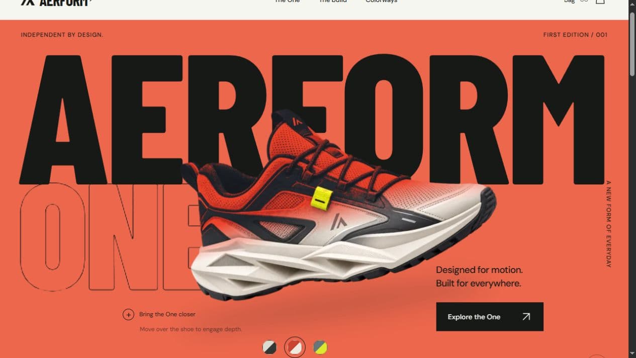
Bone / Graphite, Signal / Chalk, and Slate / Sulfur offer three expressions of the same silhouette. Selecting a colorway changes the product imagery, selected labels, and associated presentation across the experience.
The two captures below show that change in the live homepage. The complete interaction is available on the live site.
06 / Material study
A reason to go beneath the surface.
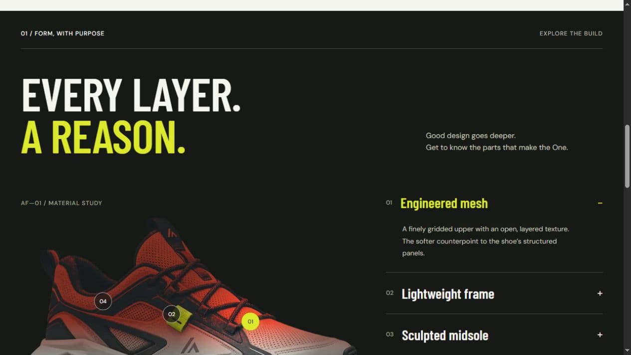
Interactive points connect the sneaker to its construction story: engineered mesh, a lightweight frame, a sculpted midsole, heel support, and rubber traction. The related accordion reveals one material explanation at a time.
These descriptions communicate a design concept. They are not tested product-performance claims.
07 / Product-page UX
From exploration to a clear choice.
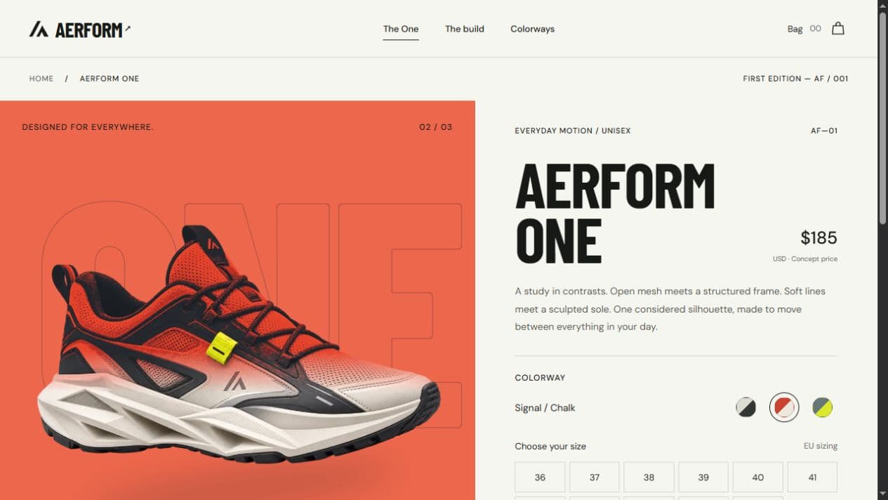
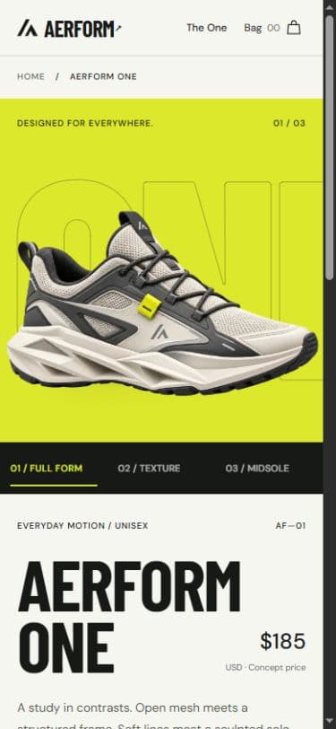
The dedicated product page brings the gallery, colorway options, and EU size selection into one place. Visitors can move between the full form, texture, and midsole views before choosing a size.
The demo bag completes the ecommerce-style interaction. Clear demonstration notices keep the boundary visible: this is a portfolio shopping flow, with no checkout or real transaction.
08 / Responsive & touch experience
Interaction beyond
the pointer.
On mobile, the gallery and product information stack into a natural reading sequence. The view controls and color choices remain explicit touch targets, and product depth can be explored through tap interaction.
The visual energy comes from the product and its pacing. The shopping choices remain recognizable on a smaller screen.
What this project demonstrates
Craft, made visible.
- 01Pointer-driven product depth and scroll choreography
- 02Interactive colorways and pseudo-3D product cards
- 03Construction and material exploration
- 04Responsive touch interaction and product galleries
- 05Size selection and an honest demo-cart experience