Portfolio Concept
MORA Studio.
A quieter kind of presence.
- Project type
- Interior architecture / Spatial design
- My role
- Creative direction, web design & development
- Explore the experience
- View live site
01 / Overview
Space for the work to speak.
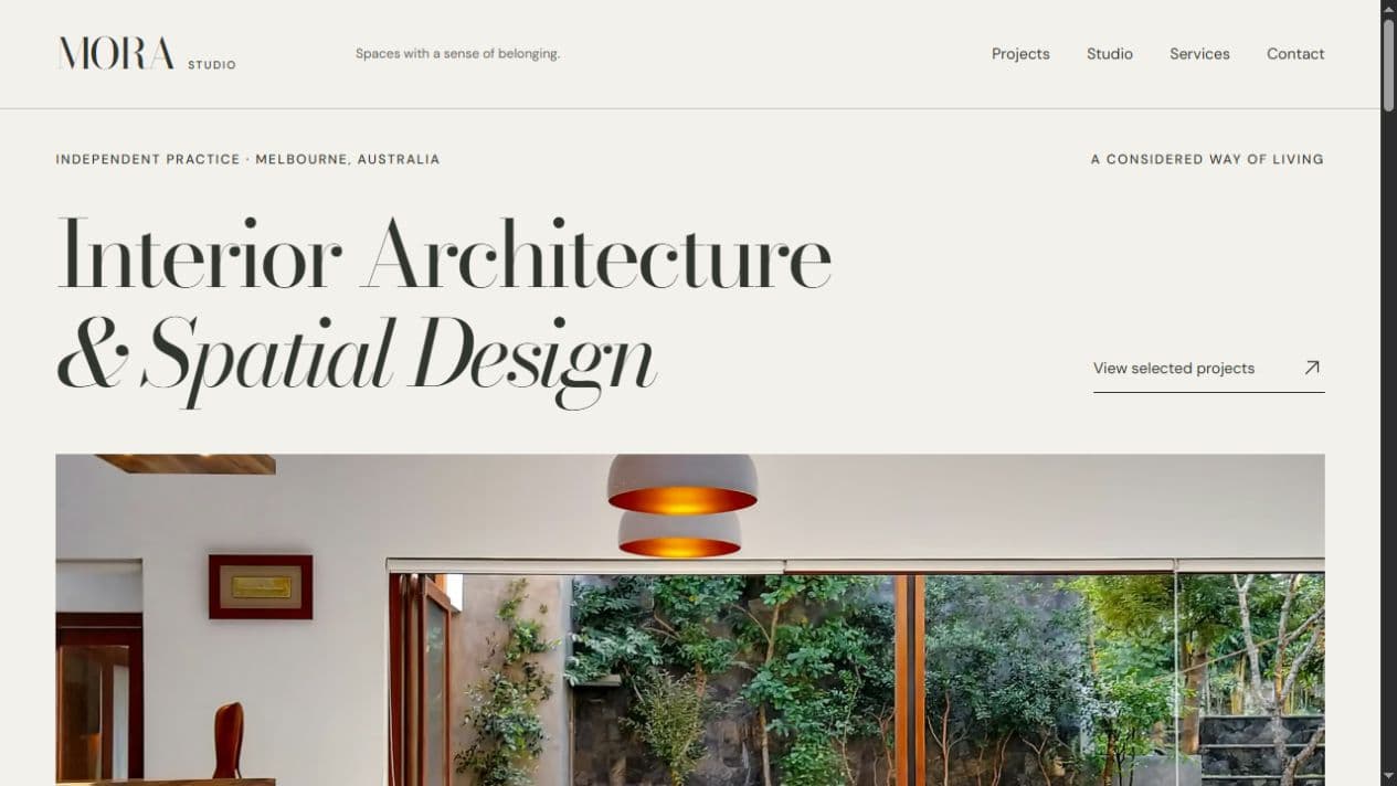
MORA is a fictional, Melbourne-inspired interior architecture and spatial design studio. I created the concept to explore how a premium business website can build a sense of trust through restraint, clarity, and a carefully paced story.
The goal was a complete editorial experience: introduce the practice, present its thinking, and let visitors move naturally from selected projects to services and contact.
Self-initiated portfolio concept. MORA was not a paid client; its studio and architectural projects are fictional.
02 / Design challenge
Premium, without the distance.
The challenge was to make the studio feel considered and approachable at the same time. Large photographs needed room to breathe, but visitors still needed to understand the practice and find their way through the website.
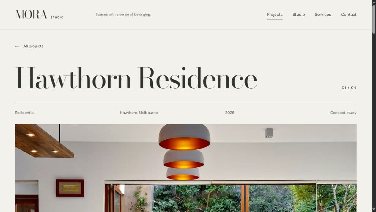
A clear page hierarchy gives each part a job. The homepage introduces the studio, the project index invites exploration, and individual project pages build a more detailed narrative.
03 / Creative direction
Material, light, and a little less.
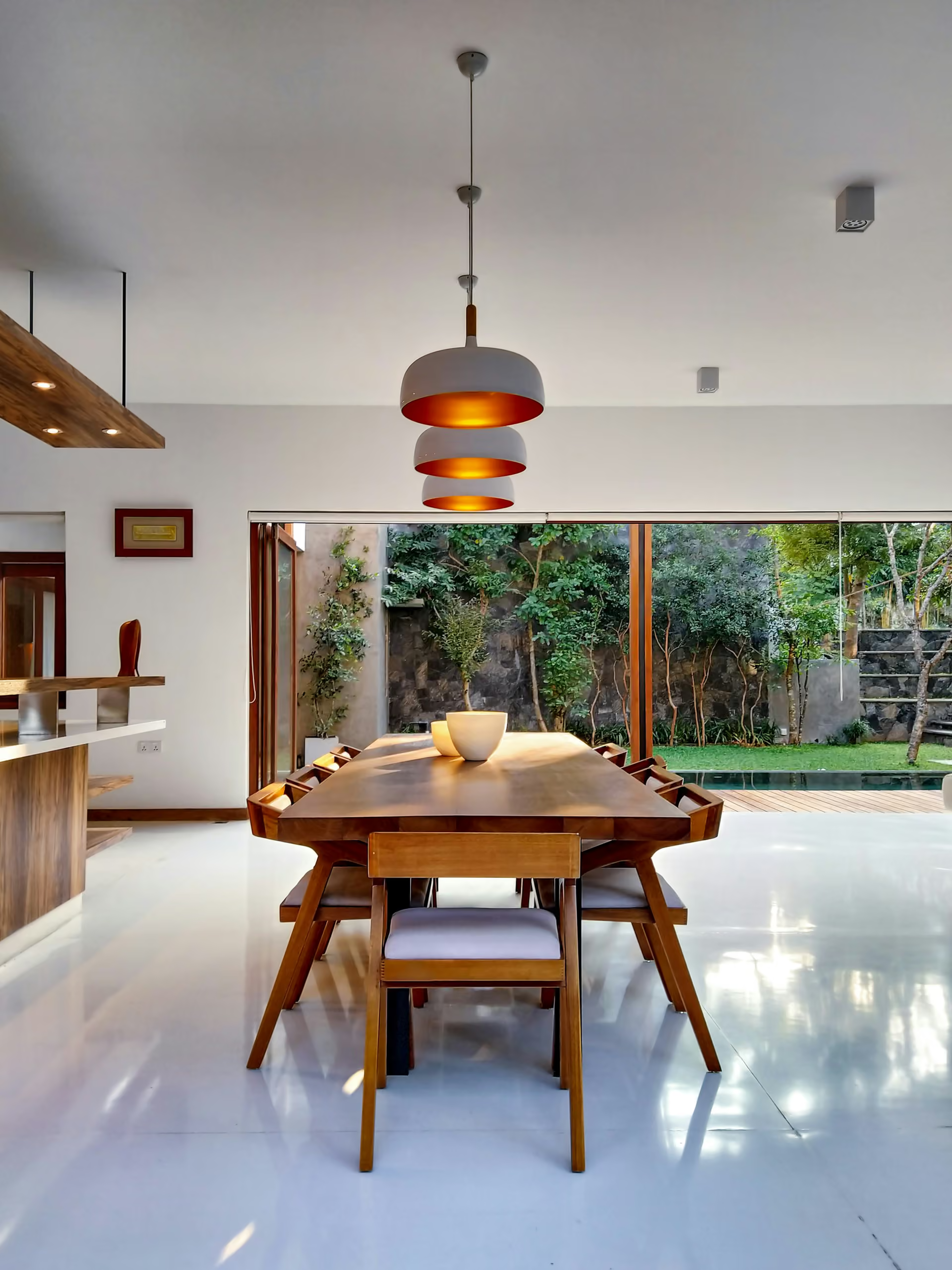
Warm neutrals, expressive serif typography, and fine rules create an editorial rhythm. The architecture photography carries the atmosphere, while the surrounding interface stays quiet.
Type size and spacing separate the big ideas from project metadata and supporting copy. The result aims to feel like browsing a thoughtfully arranged design publication.
04 / Experience decisions
A story with a natural next step.
Selected projects lead into individual stories, where a short idea, location, project type, and material direction provide context for the images. A next-project link keeps exploration moving without sending visitors back to the index.
Simple navigation, understated image transitions, and clear text links support the experience. Services and contact remain easy to find alongside the more expressive editorial pages.
05 / Responsive approach
The same care.
A different canvas.
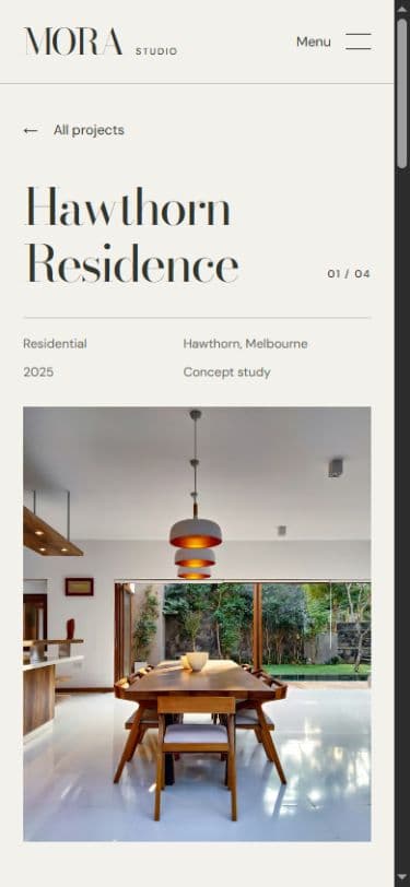
On a smaller screen, the navigation becomes a compact menu and the page settles into a single reading column. Project information remains close to the title, with the imagery following at a useful scale.
The content keeps its hierarchy through type size, spacing, and sequence. Touch users can follow the full project story without relying on hover.
What this project demonstrates
Craft, made visible.
- 01Premium editorial art direction and typography
- 02Clear multi-page business website structure
- 03Project storytelling through copy and imagery
- 04A considered, responsive implementation